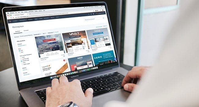
 A landing page is a dedicated page on your website that people are brought directly to from some sort of advertising or offer. This custom page is where you will convert that click on advertising into a customer in your business.
When someone visits your landing page, they’re looking to scan and not read a tonne of text. People scan to find things that are relevant to them.
Using words or phrases that are custom to your industry is going to help niche down your audience even more. Once they decide if they’re going to buy, then they start to read more of the information on your landing page.
Remember: people see a billboard, not a book. That means you need to be to very clear and to the point on your landing page.
Whenever I create a landing page for one of my products or one of my client’s products, I follow a few simple rules. This way I have consistency in my branding and advertising, and I can follow a simple structure that’s the same every time.
| RELATED CONTENT | |||||
| Revisit your web strategy to respond to trends By Yogi Schulz |
|||||
| Four questions to ask before you hire a web team By Boni and John Wagner-Stafford |
|||||
| How poor is your user experience on your apps and websites? By Yogi Schulz |
|||||
|
Use the information below to create a landing page that converts into paying customers.
Create visual hierarchies. Think of an inverted pyramid. You want to draw your visitors’ attention from big (text, images) to small (call-to-action button).
Use bullet points and highlight key terms in bold. Make sure your titles and headlines are easy for your visitor to scan, read and understand.
Users are looking for trigger or buzz words. Start with something like free copy of, trial period, start for free.
Use short paragraphs. Very short – as in three to five sentences. This might be harder than you think. You need to make sure not to leave out any relevant content and say what you need to in a maximum of five sentences.
Don’t always write in full sentences. Use simple language. Run your content past someone in Grade 8 or 9 – can they read everything clearly and do they understand what you’re selling?
Use headlines on every page. This will give your visitor a sense of orientation. It will let them know that they’re in the right place. Large text tells your visitor what to read first. I always use a simple guide when I’m formatting my headlines.
- Headline – H1
- Sub-headline – H2
- Content – H4
Focus on essential information your visitors need to know. This isn’t a place to get too wordy. Again, simple language and not too much of it. You want to be really clear about what you’re selling, how to buy and what the process is.
Read it to a teenager and see if they understand what the page means. This is no joke. It works. If it’s too complicated, then a teenager won’t understand and will be moving on to the next thing fairly quickly.
Avoid jargon or hyperbole. Not everyone will understand your obscure references and they will mostly confuse your visitors. Or worse, it distracts them and they leave.
Always have a clear call to action. This one is so important. You need to tell your visitor what to do next. Make this clear, simple (a big button with text) and make sure it works. Nothing kills conversions faster than a button that doesn’t go anywhere.
If you follow these steps when you’re creating your landing page, you will convert more visitors into customers. These are simple steps to follow and hopefully they make creating your landing page a little bit easier.
Donita Fowler is an online marketer who supports entrepreneurs in their quest to be the boss of their online platforms.
For interview requests, click here.
The opinions expressed by our columnists and contributors are theirs alone and do not inherently or expressly reflect the views of our publication.
© Troy Media
Troy Media is an editorial content provider to media outlets and its own hosted community news outlets across Canada.


